 any feedback? Is it intuitive? Easy to use??
We tried to declutter the menu bar, and make all important parts of the site easily accessible through it. AND you can now upload a profile picture 
 no one besides you can see it at the moment, but they will be used in future social features…
  (suggestions welcome!)
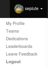
All the “in game” pages are now accessible by clicking on your username:
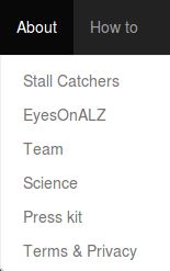
The “About” and “How to” menus are a little more organized now too, and the “About” page has been updated with new content! (Actually, a little while ago, but in case you haven’t yet seen it… check it out!)
Hope you like it! Also, hopefully it will make it easier for new users to navigate the site 
Hello !
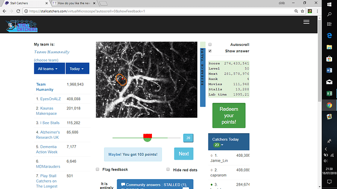
Since the new menu, the image became so small that the stalls are realy difficult to detect.
Because of a large white stroke on the right side of the screen when the menu isn’t open ?
Or could it be an other reason ?
1 Like
Christiane, I find that Control Plus (ctl-+) is useful for making the image larger. The unfortunate side effect is to have to use the mouse wheel more to view people’s comments (I want to find out what other people are saying each time).
1 Like
Dear @christiane,
Thank you for letting us know. It really shouldn’t be this way though - we’re looking into it!
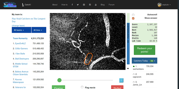
It looks like you are on laptop, so the view you see should be more like this (menu at the top, not as a burger item, and the movie bigger):
It would help us if you provided more information about your device/system @christiane:
Device:
Operating system: (is it Windows 10?)
What kind of PC/laptop is it? (brand)
What is the size of your PC/laptop screen? (inches)
What is the resolution? (should be able to tell from “Display Settings” accessible by right click on desktop)
Thank you, and hope to resolve this soon! I realize it’s affecting your catching experience  and we don’t want that!!!
Eglė
Device : Laptop
OS : windows 10
brand : lenovo V110-15IKB
inches : 15.6
resolution : 1366 x 768
Thank you
1 Like
 any feedback? Is it intuitive? Easy to use??
 no one besides you can see it at the moment, but they will be used in future social features…
  (suggestions welcome!)


 and we don’t want that!!!