Please share ALL your ideas here! (And don’t hold back!  )
)
It might be nice to make the chatbox size adjustable. Mine obscures a good portion of the green stats box and redemption button. Not a priority issue, however.
3 Likes
Noted – interface changes coming soon tho that will rearrange things a bit (and avoid this issue)
I personally love how you’ve made the movie stop when I click “stalled”, so I can click on the stalled area right away. I used to try having the movie play thru a couple of times to click on the “right” frame before it passes by again.
1 Like
Big money!!! Big prizes!!! (wait…what’s that?..say it again…) Ahem…oh yeah, peace on earth, good will towards men. Thank you.
3 Likes
I think the only thing that could be changed now is -
When clicking “stalled” button, I go up on the screen, and immediately, a white box saying something like ‘click on stall’ appears.
I CAN move off the movie removing that box, but still get it back when getting back on the movie.
I HAVE learned to bring the cursor up to a part of the movie, away from where I want to click on the stall first. But my thought is - do we need that white ‘click on stall’ box come up in the first place?
If that white box that comes up when I bring the cursor up onto the movie, could be eliminated, I think that would be a bit if an improvement for me.
Otherwise, I LOVE this site.
1 Like
Hi @chairgaf! Thank you for the note. What white box do you mean though?  I (and others from team) don’t see that… Could you send a picture / screenshot? Would like to investigate and see what we can do !!!
I see the white box all the time. As chairgaf indicated, it has an annoying habit of popping up right over the stall you wish to click on. He “fools” it by placing the cursor elsewhere so it will leave the target stall uncovered. I just click on it, it then goes away and I have to click a second time to mark the stall. It does take a moment for the box to appear, so if you’re quick enough, you can click the stall unimpeded. (I’m usually not quick enough.)
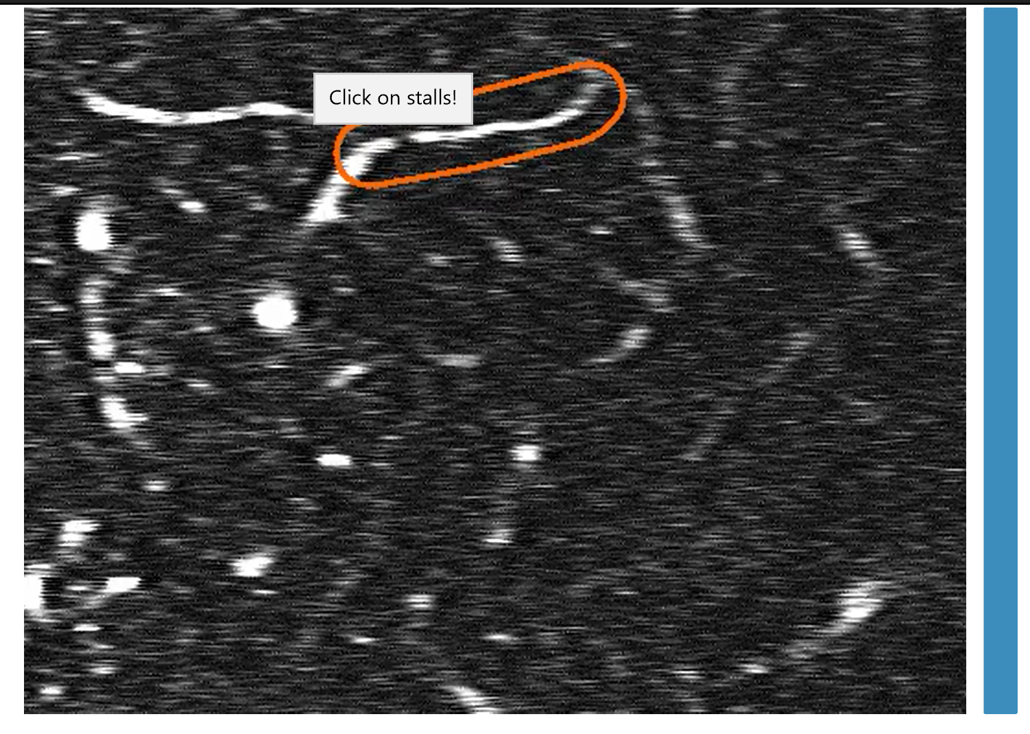
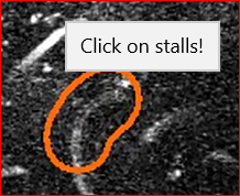
Here is a screen shot of one that’s well-behaved; it comes up without covering the stall. With the vertically oriented ovals, the box often covers the spot you want to click upon.
1 Like
I hope I did this screenshot right.
I click red stalled. Bring cursor up to movie. This “white box” comes up riight next to the cursor.
So when I point directly from the red "stalled" to the area I see is stalled, this box comes up completely over it.
My “work around” has become, slick red stall button. Put cursor anywhere in the movie frame but not near the stalled area. Once the “click on stalls” box has appeared, I then can move cursor to the stalled area and click on it.
I don’t see the need for this box, since I already want to “click on stalls”. Anyone who doesn’t know to click on the area of the stall, SHOULD GO BACK TO THE TUTORIAL! 
1 Like
OMG I CAN’T BELIEVE I NEVER NOTICED IT BEFORE!!! (sorry for yelling  as someone who designed the game it comes as a shock to me when “surprise” features have been implemented
  )
)
Actually I did look closer now, and I see such a box, except it is black for me. It also doesn’t really interfere somehow for me (I guess that’s why I didn’t notice), and disappears as soon as I move the cursor (so maybe that’s why it didn’t interfere).
Anyway, I totally agree it’s useless, and have no idea how and when it was put there!!! I will ask our dev intern to take it down immediately. And so so sorry that you’ve been pestered by this for so long!!
Glad we got ourselves on the same page. (except for the way that box looks for you).
Thanks for taking this to the “dev intern”.
Thanks for being there, Seplute. (Egle)
Until next time we talk,
chairgaf (chairflyer2013)
1 Like
I’m told the annoying white box has been removed!
I said it on the chat box. I’ll say it here. The “white box” (for the stalls) IS NOW GONE!
Thanks to Admins and Devs.
1 Like
Hello folks,
I got to thinking tonight when I got a couple of “not corrects”. When I get a “correct”, I am told the number of points for it. But no numbers deducted for the not corrects. Unless my eyes are deceiving me, it does look like the bar (the vertical one next to the movie) drops down a bit. Then continues to rise again, when I get a “correct”.
I’d personally appreciate seeing how many points I am losing from the blue bar, when I get a “not correct”.
As always, thanks for this site.
chairgaf
1 Like
Hi, chairgaf. You never “lose” points. However, when you miss a calibration, your skill level takes a hit as indicated by the blue bar dropping a bit. The number of points you receive for “correct” responses, as you know, is directly proportional to your skill level. So, when your blue bar is at maximum, you get 116 points for non-calibration movies, 2320 points for flow calibration movies, and either 2320, 4640, 6960, or 9280 points for the various stall calibrations. If your skill bar is at half mast, you would expect to get half those numbers of points.
So, when you ‘miss’ a calibration, and your skill level drops a bit (which varies, better to miss a flow than a stall), you could say, “Well, I was getting 110 points per regular movie, now I’m only getting 98; I’m losing 12 points per movie.” In that sense you are ‘losing’ points, but points are never deducted from your score.
Hope that helps.
Mike C.
PS. For advanced players, there is a bit of an exception. If your skill bar has been at max for some time, when you finally miss a calibration, the bar might drop much less than you’d expect, or perhaps not at all - no penalty. Miss again soon thereafter, however, and watch it plummet!
1 Like
Interesting point @chairgaf (and thank you for the explanation @caprarom  ) – I suppose we could, in principle, implement something that shows how much the blue bar dropped (like -5% sensitivity/skill or something similar) each time you make a mistake…
one thing I’ve noticed, since I started playing without the “show answer” check box CHECKED.
I see that there is no way for me to enter anything into the “community answers” chat box area when I have the “show answer” unchecked.
I’s
d like to have that “community answers” entry field when not using the “show answers” check box.
There are enough movies I’d like to comment on, and without the community answers field available when not using the show answers check blx, I cannot do it.
If you need a clearer explaination of this request, please contact me here, or at chairflyer2013@yahoo.com
Thanks,
chairstar
I also would like to say. Having the black areas on these movies may be to try making the movies a little more easier on the eyes, to block any large vessels we don’t need to annotate. But I’ve seen many times when the entire circled areas are blacked out, that I cannot see the vessel of interest until almost half way into the movie.
I would be ok with the blackouts, if they could be more careful not to interfere with the circled areas.
Thanks again,
chairstar
After all the time I’ve been on StallCatchers, I just thought of this.
\ When we click “stalled” annotating a movie, it brings up an ‘undo’ button. So you can reconsider that a vessel is flowing.
But we don’t have an ‘undo’ button when we click the green ‘flowing’ button. So we can reconsider switching from “flowing” to “stalled”.
This would be nice to have since I honestly do click one, when I wanted to click the other.
Thought I’d bring this up.
Thanks
1 Like
Thank you for the suggestion @chairgaf!  as far as I recall, we made the decision to do it this way to avoid random “stalled” responses - that’s why you need to take an extra “step” to click directly on the stalls, but to make that work, we also had to introduce the “undo” button, so you have a chance to go back as well. it’s a sort of “recaptcha”, I guess, so there’s no bots clicking “stalled” endlessly and tainting the data, and similar.
But perhaps we can think of a similar way to cancel the “flowing” choice! On the other hand, we’ve been asked many times to make the process even quicker and minimize clicks (no “Next” button for example, instead it just advances to the next movie), so maybe that would slow folks down too much too?!  good food for thought though!